


I’m running out of things to say in these intros, so let’s just get to the graphs.

An Important World Cup Metric
The biggest event in sports last month was, of course, the World Cup. International fans did their typical soccer fan things - from drinking Boston dry to rowing through Times Square - but what was more unusual was how much the US, as a host country, collectively bought into the hype. I saw way more coverage of the 2026 matches than I did in 2022 or 2018, with lots of interesting analyses that got me more invested.1 That also meant more charts, with the star being the in-game momentum bars.
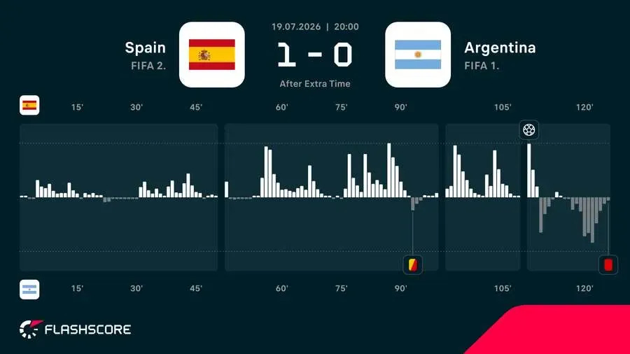
The problem is no one really understood what they meant. Other than more momentum = good that is. if you’re curious, this explanation from The Athletic is a helpful one, but in it Jon Mackenzie also explains why it’s actually not super useful in predicting outcomes.
Instead I preferred this calculation, which perfectly predicted the winner of every match in the round of 16.
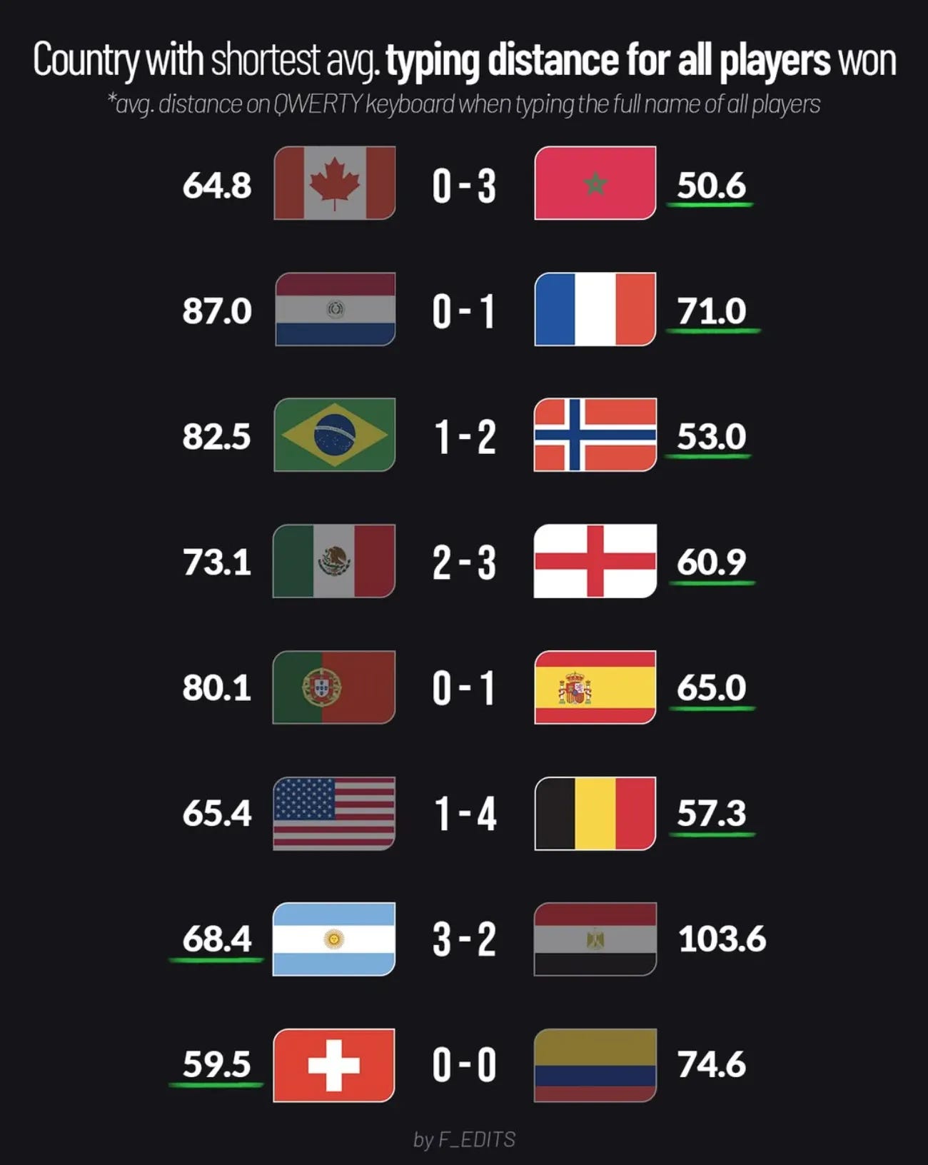
Congratulations to Spain for winning the World Cup, but potentially bigger congratulations to F_EDITS for even thinking to look at keyboard key distances’ correlation to soccer games.
LeBron James
The biggest news in the basketball world from July was that LeBron James rejected tidy narratives to sign with the Philadelphia 76ers. Not only do the Sixers get the King’s services for two years, they get them at one of the steepest discounts I can remember. In unquestionably “not a financial decision”, LeBron signed for two-years, $8 million. People across the internet have found creative ways to put that in context (my contribution: he spent five times that salary on a house in LA, just to tear it down!), but the clearest comes from datakabas.
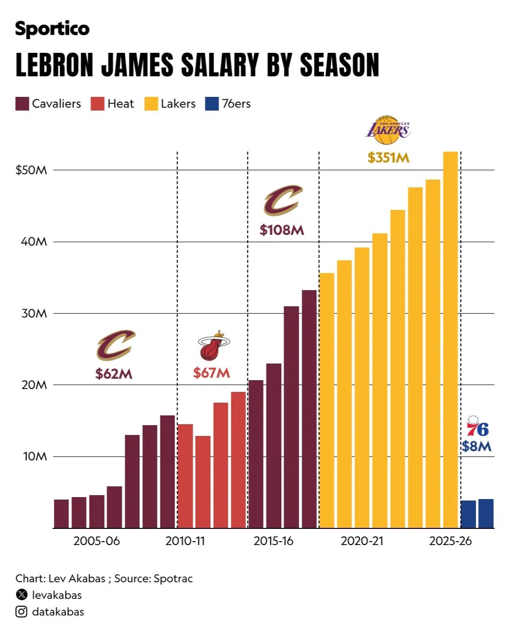
Given all the money LeBron has made in the NBA (to go along with his SAG-AFTRA paychecks of course) this $8 million salary will only increase his net worth by 0.5%.
It also means a return to the Eastern Conference for James, where he hasn’t lost since 2010.
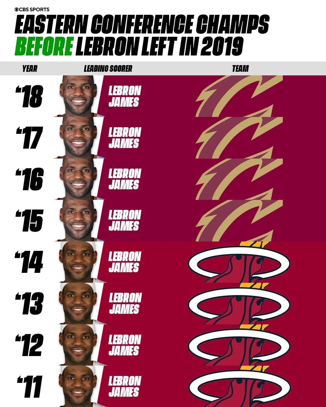
2010!
By signing James, as well as trading for Jaylen Brown, the Sixers lineup is looking pretty well set up to continue James’ run of East dominance. The team can trot out a starting five with two former MVPs and a former Finals MVP, arguably none of whom are their best player (Tyrese Maxey) or best asset (VJ Edgecombe).
If you want to dig deeper, Nekias Duncan and Steve Jones Jr. did a great breakdown of what they expect on the court in Philadelphia next season on the Dunker Spot podcast.
Net Maps
After the Knicks won the NBA Finals in June, designer Johnny Selman overlaid the New York City subway map onto an orange hoop, creating this very cool net effect.

Beautiful.
Seattle quickly followed up with their own city on a Sonics-themed yellow hoop and green background, with Climate Pledge Arena - where residents hope to watch professional men’s basketball in the next few years - centered right at the back of the rim.
A Literary Map of America
My second favorite map design of the month comes from Big Thinkers.2 They plotted “over 400 literary landmarks and travel routes” on an old-timey map of the US.
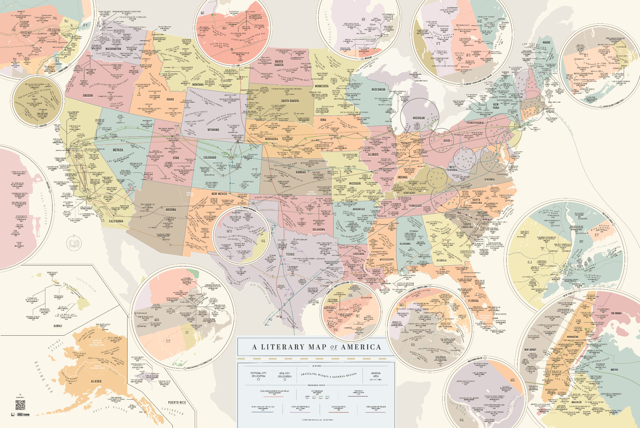
I liked zooming in on the image, and seeing what classic tales took place next to each other, decades apart; for example, The Bell Jar and Infinite Jest.
Peak Music
I also came across this simple scatterplot in July, proving with data that the best music came out when we were growing up.
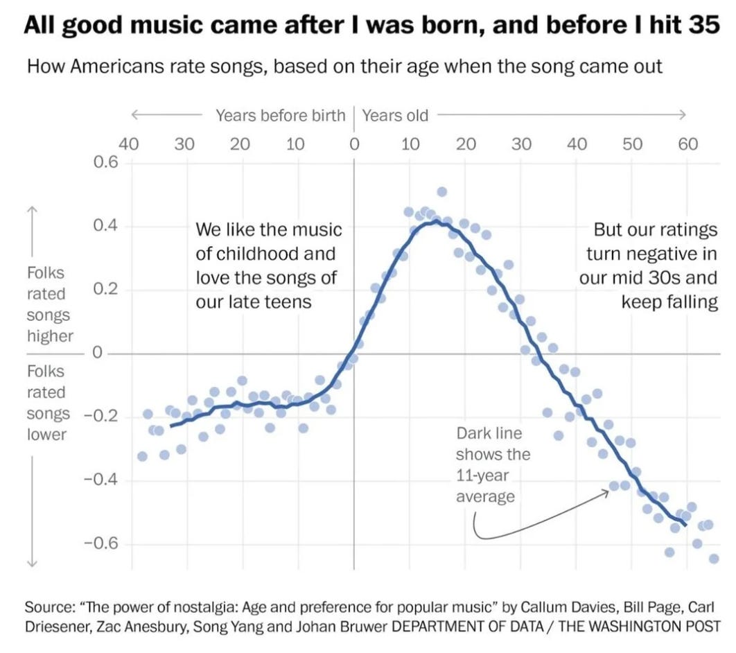
Let me know if this holds true for you, or if you are an outlier!
Personally, I like 70s classic rock and 90s rap much more than this trend would imply, but it is spot on for my age 10 peak year, 2004, when Green Day released the best album of all time, American Idiot.
Understanding Emotions
The researchers behind that music chart were focused on the impact of nostalgia, or longing, which is a combination of hope and disappointment according to this table that fell into my Instagram algorithm.
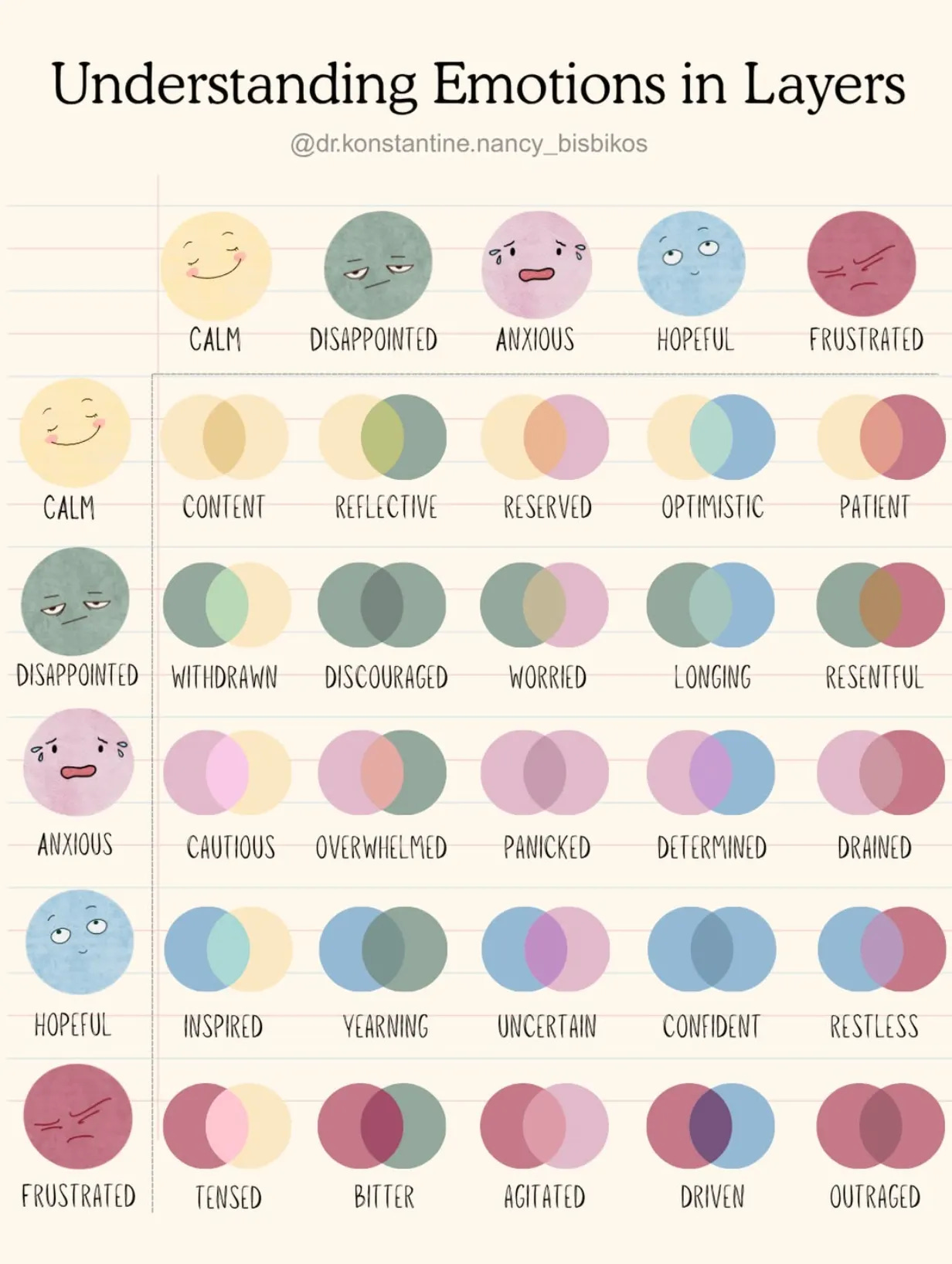
I’ve talked about (and yes, tried to quantify) emotion graphics before, but I especially like this one for helping to expand vocabulary for the more complex emotions. While we’re here, I recommend the How We Feel app. It prompts you a few times a day to simply input how you are feeling in that moment through a very smooth UI. I find it helpful to remind me to recognize my emotions throughout the day, and celebrate a positive mood or make a change if needed.
Come on England!!
Great name.
I agree with Eric. These charts are interesting and clarity of the information is great. I’ll be truthful, I don’t always understand the graphs. I will be looking at the hoop maps more in depth. I downloaded the emotions app.
The charts this month seem a little extra beautiful and interesting! That emotion grid definitely has me admiring it and wondering if it’s systematically designed and what expansions/alternatives are possible