

How To: WOW(Y)
Calculating lineup overlaps (with you without you) in R

I’m in the midst of posting observations on lineup patterns around the NBA; the Eastern Conference article is live, with the West coming next Wednesday. In the interim, I thought I’d walk you through how I pull together the data to track when any two players share the court, and how to use that data to create heatmaps like this
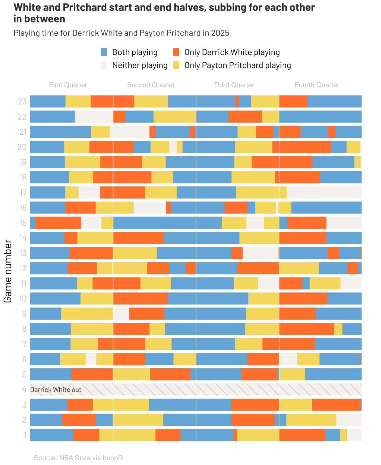
and bar charts like this

Gathering the Data
For this tutorial, we’ll need three pieces of data.
Team IDs to filter down the data to the team of interest.
library(hoopR)
team_ids <- nba_teams() %>% select(c(team_abbreviation, team_id, logo))
Player IDs to personalize the bar charts for the players of interest.
player_ids <- nba_commonallplayers(league_id = '00', season = '2025-26')$CommonAllPlayers %>%
  select(DISPLAY_FIRST_LAST, PERSON_ID, TEAM_ABBREVIATION)
Play by play. Normally, the hoopR package allows easily loading play by play data into R, with the
nba_pbps()function. However, since I first pulled the data the function seems to have broken. While the Good Samaritans at SportsDataverse work on getting that back up and running, you can pull play by play data directly from the NBA Stats API using theplaybyplayv3endpoint. You’ll also need rotation information. Specifically for the code below to work you’ll need 10 columns to track the 10 players on the court for a given play. hoopR’s function has those columns built in, while using the NBA API requires adding in theGameRotationendpoint.
The hoopR pbps() function doesn’t return the number of minutes into the game as a default column, so we need to calculate it using the time columns they do provide. If you’re using the NBA Stats API method for pulling play by play, this should already be included.
pbps <- pbps %>% mutate(game_time_elapsed = ((period - 1) * 12) + (12 - minute_remaining_quarter - (seconds_remaining_quarter/60)))I find it cleaner for the final charts to remove overtimes, which we can do at this step by only keeping plays that happen in the first 48 minutes.
pbps <- pbps %>% filter(game_time_elapsed < 48.0)Then we can choose the team we want to evaluate, and filter down the play by play data to just their games.
current_team = 'BOS'

# Get game logs
team_id <- team_ids$team_id[team_ids$team_abbreviation == current_team]
current_team_lineup_game_logs <- nba_teamgamelog(team_id = team_id, season = '2025-26', season_type = 'Regular Season')$TeamGameLog

# Get unique game IDs
current_team_game_ids <- current_team_lineup_game_logs %>% select(Game_ID) %>% distinct() %>% select(Game_ID)

# Add NBA code prefix ('00') and change Game_ID to a Character for Filtering
pbps <- pbps %>% mutate(game_id = paste0('00', as.character(game_id)))

# Filter for Current Team
current_team_pbps <- pbps %>% filter(game_id %in% current_team_game_ids$Game_ID)
Somewhat annoyingly, the actual number values in Game_ID are not in chronological order for when the games were played. Instead we need to save the original order returned by the nba_teamgamelog() function (in reverse so the earliest game is first) and apply it to the pbps dataframe as a factor.
# Sort games from earliest to latest
current_team_game_ids <- rev(current_team_game_ids)

# Order by Game (Game IDs not always in ascending order)
current_team_pbps <- current_team_pbps %>% mutate(game_id = factor(game_id, levels = current_team_game_ids$Game_ID))
current_team_pbps <- current_team_pbps %>% arrange(game_id)
Now we’re ready to chart! We’ll start with the heatmaps.
Heatmaps
The goal of these heatmaps is to show, of all the games a player has played, what percent of the time they appear on the court in a given minute of the game. Therefore, we need to organize the data so we can view every player x minute combination in every game of the season. That’s actually pretty easy with R’s pivot_longer() function, which transforms columns into rows; in this case the columns are the ones that record which players are on the court.
# Columns with players on court
player_cols <- c(
  'home_player1', 'home_player2', 'home_player3', 'home_player4', 'home_player5',
  'away_player1', 'away_player2', 'away_player3', 'away_player4', 'away_player5'
)

# Pivot player columns into long format
pbps_long <- current_team_pbps %>%
  # Round down the minute of the game (results in 0-47 minutes)
  mutate(minute = floor(game_time_elapsed)) %>%
  select(game_id, all_of(player_cols), minute) %>%
  pivot_longer(
    cols = all_of(player_cols),
    names_to = 'team_player',
    values_to = 'player_id'
  ) %>%
  # Remove missing or blank players
  filter(!is.na(player_id) & player_id != '') %>%
  # Remove duplicate player/minute combos
  distinct(game_id, player_id, minute)
Now we can count up the number of games each player was on the court in each minute with a simple summarize() function, using n() which returns a count of the number of rows.
minutes_played <- pbps_long %>%
  group_by(player_id, minute) %>%
  summarize(games_played_minute = n(), .groups = 'drop')
That tells us the total number of games a player was on the court in each minute, but we want the percentage of their games, so we also need the total number of games a player has played to use as the denominator. By the way, if you wanted to use the heatmap to show the percentage of team games a player was on the court, you can use that number in the denominator instead. I’ll stick with player games for this tutorial, which we can get from the pbps_long dataframe in a similar way as the games by minute, just not grouping by minute this time.
games_per_player <- pbps_long %>%
  distinct(game_id, player_id) %>%
  group_by(player_id) %>%
  summarize(total_games = n())
Then we merge those two datasets so we can see, at the same time, the number of games a player has played in a given minute and the total number of games a player has played, and ultimately calculate the percentage to use in the heatmap.
data_long <- minutes_played %>%
  left_join(games_per_player, by = 'player_id') %>%
  mutate(percentage = 100 * games_played_minute / total_games,
         player_id = as.character(player_id))
That dataframe should look something like this.
Next, we’ll do a couple of formatting things to make the chart look nicer. For the labels, we’ll pull back in the players’ names and their team, matching on their player id.1
# Create ID to name lookup vector
id_to_name <- setNames(player_ids$DISPLAY_FIRST_LAST, player_ids$PERSON_ID)

# Create ID to team lookup vector
id_to_team <- setNames(player_ids$TEAM_ABBREVIATION, player_ids$PERSON_ID)

# Attach name and team
data_long <- data_long %>% mutate(player_names = map_chr(player_id, ~ paste(id_to_name[.x])),
                     team_abr = map_chr(player_id, ~ paste(id_to_team[.x])))
Before plotting, we need to filter for our selected team’s players once more since we’ve only filtered for games so far, and obviously there is an opponent in every game whose players are currently included. We can also filter out the players who don’t play often enough for our taste if wanted.
# Filter for team players
data_long <- data_long %>% filter(team_abr == current_team)

# Filter out low minutes players
data_long <- data_long %>% filter(total_games >= 10)

# Fill never appearing player minute combos with 0
data_long_complete <- data_long %>%
  complete(player_names, minute, fill = list(percentage = 0))
Then we can select the order of the bars; I decided to sort by descending minutes per game.
# Calculate average percentage per player
player_avg <- data_long_complete %>%
  group_by(player_names) %>%
  summarize(avg_percentage = mean(percentage, na.rm = TRUE)) %>%
  arrange(desc(avg_percentage))

# Reorder by descending average percentage
data_long_complete$player_names <- factor(
  data_long_complete$player_names,
  levels = player_avg$player_names
)

# Reverse factor to put highest average on top (since y-axis in ggplot plots bottom to top)
data_long_complete$player_names <- fct_rev(data_long_complete$player_names)
Now we plot!
library(ggplot2)

heatmap <- ggplot(data_long_complete, aes(x = minute, y = player_names, fill = percentage)) +
  geom_tile(color = "white", width = 0.9, height = 0.9) +
  # Gradient colors
  scale_fill_gradient2(
    low = "#f4f0ee",
    mid = "#f4d65c",
    high = "#ff6e2a",
    midpoint = 50,
    limits = c(0, 100)
  ) +
    labs(title = str_wrap("", width = 83),
       subtitle = str_wrap("Percentage of Games a Player Played in a Given Minute", width = 85),
       caption = "") +
  # Allow drawing outside plot panel (for quarter labels)
  coord_cartesian(clip = "off") +
  theme_minimal(base_size = 36) +
  # Add expansion only to the left side (for player labels)
  scale_x_continuous(expand = expansion(mult = c(0.15, 0))) +
  theme(
    # Change font family
    text = element_text(family = "Barlow"),
    # No x-axis title
    axis.title.x = element_blank(),
    #Add padding to y-axis title
    axis.title.y = element_blank(),
    # No x-axis labels
    axis.text.x = element_blank(),
    # Right align labels
    axis.text.y = element_text(color = "#2b2b2b", hjust = 1, margin = margin(r = -150)),
    axis.line.y = element_blank(),
    # No legend title
    legend.title = element_blank(),
    # Legend on top of chart
    legend.position = "top",
    legend.justification = "left",
    legend.box.just = "left",
    legend.key.width = unit(2.5, "cm"),
    legend.key.height = unit(0.8, "cm"),
    # No grid lines
    panel.grid.major = element_blank(),
    panel.grid.minor = element_blank(),
    plot.margin = margin(15, 15, 15, 0),
    # Remove panel border (plot area border)
    panel.border = element_blank(),
    # Remove outer plot border by setting border color to NA
    plot.background = element_rect(fill = "transparent", color = NA),
    panel.background = element_rect(fill = "transparent", color = NA),
    plot.title = element_text( #Format title
      color = "#2b2b2b",
      size = 36,
      face = "bold",
      hjust = 0 # Center the title
    ),
    plot.subtitle = element_text( #Format subtitle
      color = "#2b2b2b",
      size = 36,
      face = "bold",
      hjust = 0 # Left-align the title
    )
  ) +
  # Add quarter separator lines and labels
  geom_vline(xintercept = 11.5, color = "#f4f0ee", linetype = "solid", size = 1) +
  geom_vline(xintercept = 23.5, color = "#f4f0ee", linetype = "solid", size = 1) +
  geom_vline(xintercept = 35.5, color = "#f4f0ee", linetype = "solid", size = 1) +
  annotate("text", x = 5.5, y = length(unique(data_long$player_id)) + 0.8, label = "First Quarter", size = 9, color = "gray") +
  annotate("text", x = 17.5, y = length(unique(data_long$player_id)) + 0.8, label = "Second Quarter", size = 9, color = "gray") +
  annotate("text", x = 29.5, y = length(unique(data_long$player_id)) + 0.8, label = "Third Quarter", size = 9, color = "gray") +
  annotate("text", x = 41.5, y = length(unique(data_long$player_id)) + 0.8, label = "Fourth Quarter", size = 9, color = "gray") +
  # Add source
  annotate("text", x = 7, y = 0, label = "Source: NBA Stats via hoopR • Minimum 10 game appearances", size = 9, color = "gray")

# Resize plot
heatmap <- heatmap + canvas(h = 20, w = 20, units = "in", dpi = 600)

heatmap
Voila! Shades of orange!
Overlap Bar Charts
The heatmaps show the breakdown for all players, while these bar charts show the overlap for just a couple of players, so we start by choosing those players and getting their player ids. It’s generally better to work with IDs than names for the rare cases where two players have the same name or spellings differ (e.g., Jimmy Butler vs Jimmy Butler III).
current_player1 = 'Derrick White'
player1 <- player_ids$PERSON_ID[player_ids$DISPLAY_FIRST_LAST == current_player1]

current_player2 = 'Payton Pritchard'
player2 <- player_ids$PERSON_ID[player_ids$DISPLAY_FIRST_LAST == current_player2]
To calculate the overlap between these two players, I’ve set up a couple of “helper” functions. Together, they take the play by play data and the players of interest, and create a new table that records which of the players was in the game for each and every play.
get_player_combo <- function(players_on_court, key_players) {
  # Identify which key players are present in this minute
  present <- key_players[key_players %in% players_on_court]
  if (length(present) == 0) {
    return("None")
  } else {
    # Canonical sorted string, e.g. "PlayerA+PlayerB"
    return(str_c(sort(present), collapse = "+"))
  }
}

calculate_player_overlap <- function(df, key_player_ids) {
  df %>%
    group_by(game_id, game_time_elapsed) %>%
    # Take the last play in each minute for each game
    slice_tail(n = 1) %>%
    mutate(
      # Combine all player ids into one vector
      players_on_court = pmap(list(
        away_player1, away_player2, away_player3, away_player4, away_player5,
        home_player1, home_player2, home_player3, home_player4, home_player5
      ), c),
      combo = map_chr(players_on_court, ~ get_player_combo(.x, key_player_ids))
    ) %>%
    ungroup() %>%
    select(game_id, game_time_elapsed, combo)
}
Let’s test it out.
key_player_ids <- c(player1, player2)
overlap_df <- calculate_player_overlap(current_team_pbps, key_player_ids)
You should get something like this.
That’s really all we need. From here we’ll just clean it up a bit. First, we’re really only interested in the plays when one of our players enters or exits the game. We can filter for these changes by comparing the combo in one play to the combo in the previous play using the lag() function, and filter for cases when they are different (!= operator).
overlap_changes_df <- overlap_df %>%
  group_by(game_id) %>%
  arrange(game_id, game_time_elapsed) %>%
  mutate(combo_change = combo != lag(combo, default = first(combo))) %>%
  # keep the first row for each game
  filter(combo_change | row_number() == 1) %>%
  ungroup()
It’ll be easier to track the start and end times for a given combo in the same row, which we can do with the opposite of lag(), lead() to pull forward the time when the next substitution is made.
overlap_changes_df <- overlap_changes_df %>%
  rename(start_time = game_time_elapsed) %>%
  group_by(game_id) %>%
  arrange(game_id, start_time) %>%
  mutate(end_time = lead(start_time)) %>%
  ungroup()
There are, unfortunately, lots of injuries keeping star players out of games this year. Technically, the data set will work as is for games where one or both of the players does not play, but since we’re looking at combinations, it’s not particularly interesting to see this kind of chart for one player. Instead we’ll grey out those games.
The code below records which of the two players of interest played in the game, and if one is missing, it marks that game with “[Player Name] out” in a new column called missing_players.
# Make id-to-name mapping
id_to_name <- setNames(player_ids$DISPLAY_FIRST_LAST, player_ids$PERSON_ID)

# For each game, check if each tracked player ever appeared in any combo
game_player_status <- overlap_changes_df %>%
  group_by(game_id) %>%
  summarize(
    players_present = unique(unlist(str_split(combo, "\\+")))
  ) %>%
  mutate(
    missing_players = map(game_id, function(gid) {
      present <- players_present[game_id == gid]
      missed <- setdiff(key_player_ids, present)
      if(length(missed) == length(key_player_ids)) {
        "Both"
      } else if(length(missed) > 0) {
        id_to_name[missed]
      } else {
        NA_character_
      }
    })
  )

# Attach ‘missing_players’ info to each game
overlap_changes_df <- overlap_changes_df %>%
  left_join(game_player_status %>%
              select(game_id, missing_players), by = "game_id")
Again, before we plot we’ll do some formatting prep:
Mark the end of games at 48 minutes.
overlap_changes_df$end_time[is.na(overlap_changes_df$end_time)] <- 48Track the game number of the season for the y-axis.
overlap_changes_df <- overlap_changes_df %>%
  arrange(game_id, start_time) %>%
  mutate(game_no = as.integer(factor(game_id, levels = unique(game_id))))
Bring back the player names from player ids for the legend.
# Create ID to name lookup vector
id_to_name <- setNames(player_ids$DISPLAY_FIRST_LAST, player_ids$PERSON_ID)

overlap_changes_df <- overlap_changes_df %>%
  mutate(
    player_names = if_else(
      combo == "None", "Neither playing",
      # Split combo string by +, map each ID to name, then collapse back with +
      map_chr(str_split(combo, "\\+"), ~ paste(id_to_name[.x], collapse = "+"))
    )
  )

overlap_changes_df <- overlap_changes_df %>%
  mutate(player_labels =
    # If there is a "+", both players are playing
    ifelse(grepl("\\+", player_names), "Both playing",
    ifelse(player_names == "Neither playing", "Neither playing",
    paste("Only", player_names, "playing"))))
Set the legend order.
label_levels <- c(
  "Both playing",
  "Neither playing",
  paste("Only", current_player1, "playing"),
  paste("Only", current_player2, "playing"),
  "Player Out")
overlap_changes_df$player_labels <- factor(overlap_changes_df$player_labels, levels = label_levels)
Set the legend colors.
palette <- c(
  "Both playing" = "#64a4d4",
  # Note: You need to change the player names here manually!!
  "Only Derrick White playing" = "#ff6e2a",
  "Only Payton Pritchard playing" = "#f4d65c",
  "Neither playing" = "#f4f0ee",
  "Player Out" = "#f4f0ee"
)

names(palette) <- c(
  "Both playing",
  paste("Only", current_player1, "playing"),
  paste("Only", current_player2, "playing"),
  "Neither playing",
  "Player Out")
Format the “Player out” bars (grey stripes with a note).
# Color entire bar grey if 1+ player is out
overlap_changes_df <- overlap_changes_df %>%
  mutate(
    player_labels = ifelse(!is.na(missing_players), "Player Out", as.character(player_labels))
  )

# Add a stripe pattern if 1+ player is out
overlap_changes_df$pattern_type <- ifelse(overlap_changes_df$player_labels == "Player Out", "stripe", "none")

# Make a summary frame for Player Out annotations
annotations <- overlap_changes_df %>%
  filter(player_labels == "Player Out") %>%
  group_by(game_id, game_no) %>%
  summarise(
    label = unique(missing_players),
    start_time = 0,
    end_time = 48,
    player_labels = "x"
  )
And now we plot!!
plot <- ggplot(overlap_changes_df, aes(
  y = factor(game_no, levels = sort(unique(game_no))),
  xmin = start_time,
  xmax = end_time,
  fill = player_labels
)) +
  geom_rect_pattern(
    aes(
      ymin = as.numeric(factor(game_no)) - 0.4,
      ymax = as.numeric(factor(game_no)) + 0.4,
      pattern = pattern_type
    ),
    color = NA,
    pattern_color = "#e5e5e5", #Stripe color
    pattern_density = 0.1,
    pattern_spacing = 0.02,
    pattern_angle = -45,
    show.legend = c(pattern = FALSE, fill = TRUE)
  ) +
  geom_text(
    data = annotations,
    aes(
      y = factor(game_no, levels = sort(unique(game_no))),
      x = start_time,
      label = paste(label, "out")
    ),
    color = "#2b2b2b",
    family = "Barlow",
    hjust = 0, # left align
    vjust = 0.5, # vertically center on bar
    size = 9, # font size
  ) +
  scale_fill_manual(values = palette,
                    breaks = label_levels[1:length(label_levels)-1], #Exclude "Player Out" from legend
                    labels = label_levels[1:length(label_levels)-1] #Exclude "Player Out" from legend
  ) +
  guides(
    fill = guide_legend(
      title = NULL,
      label.position = "right",
      label.hjust = 0,
      nrow = 2,
      override.aes = list(pattern = "none", size = 2, shape = 15, linewidth = 6) #Square legend keys
    )
  ) +
  scale_pattern_manual(values = c("stripe" = "stripe", "none" = "none")) +
  scale_y_discrete("Game number") +
  scale_x_continuous("", breaks = c(0,12,24,36,48)) +
  # Titles
  labs(title = str_wrap("White and Pritchard start and end halves, subbing for each other in between", width = 65),
       subtitle = str_wrap(paste("Playing time for", current_player1, "and", current_player2, "in 2025"), width = 75),
       caption = "") +
  coord_cartesian(clip = "off") +  # Allow drawing outside plot panel
  theme_minimal(base_size = 40) +
  theme(
    text = element_text(family = "Barlow"), #Change font family
    axis.title.x = element_blank(), #No x-axis title
    axis.title.y = element_text(margin = margin(r = 15)), #Add padding to y-axis title
    axis.text.x = element_blank(), #No x-axis labels
    axis.text.y = element_text(color = "gray", hjust = 1, margin = margin(r = -60)),  # Right align labels
    axis.line.y = element_blank(),
    legend.title = element_blank(), # No legend title
    legend.position = "top", #Legend on top of chart
    legend.text = element_text(hjust = 0.5), #Center legend
    panel.grid.major = element_blank(), #No grid lines
    panel.grid.minor = element_blank(), #No grid lines
    plot.margin = margin(15, 15, 15, 15),
    panel.spacing = unit(2, "lines"),
    panel.border = element_blank(),         # Remove panel border (plot area border)
    plot.background = element_rect(fill = "white", color = NA),  # Remove outer plot border by setting border color to NA
    plot.title = element_text( #Format title
      color = "#2b2b2b",
      size = 40,
      face = "bold",
      hjust = 0 # Left-align the title
    ),
    plot.subtitle = element_text( #Format subtitle
      color = "#2b2b2b",
      size = 32,
      #face = "bold",
      hjust = 0 # Left-align the title
    )
  ) +
  # Add quarter separator lines and labels
  geom_vline(xintercept = 12, color = "white", linetype = "solid", size = 1) +
  geom_vline(xintercept = 24, color = "white", linetype = "solid", size = 1) +
  geom_vline(xintercept = 36, color = "white", linetype = "solid", size = 1) +
  geom_vline(xintercept = 48, color = "white", linetype = "solid", size = 1) +
  annotate("text", x = 5.5, y = max(overlap_changes_df$game_no) + 1.1, label = "First Quarter", size = 9, color = "gray") +
  annotate("text", x = 17.5, y = max(overlap_changes_df$game_no) + 1.1, label = "Second Quarter", size = 9, color = "gray") +
  annotate("text", x = 29.5, y = max(overlap_changes_df$game_no) + 1.1, label = "Third Quarter", size = 9, color = "gray") +
  annotate("text", x = 41.5, y = max(overlap_changes_df$game_no) + 1.1, label = "Fourth Quarter", size = 9, color = "gray") +
  # Add source
  annotate("text", x = 7, y = -0.5, label = "Source: NBA Stats via hoopR", size = 9, color = "gray")

# Resize plot
plot <- plot + canvas(h = 25, w = 20, units = "in", dpi = 600)

plot
More colors!!
That’s it for now; I’ll leave it as an exercise for the reader to extend this to 3-player combinations. I’d love to know what other player combos you explore, or how else you apply this code. Make sure to check back next week to see what I find interesting in the Western Conference lineup patterns.
Helpful debugging tip: if you search a player (or even game) id, followed by “NBA”, Google pulls up the right player/game on nba.com.