

Look at this Graph
Charts I Liked in April

LeBron’s Playoff Experience
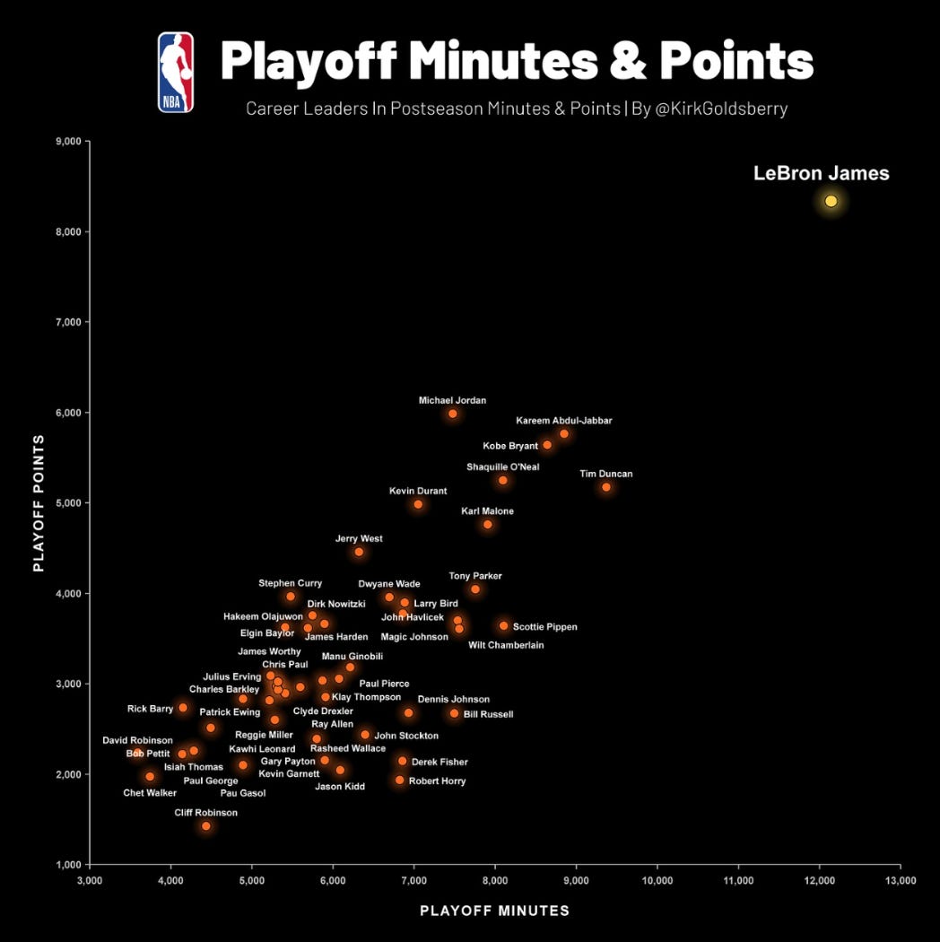
A few weeks ago, I looked into how much Playoff experience different teams have in their starting lineups for my piece on The Value of Losing. One of the points I made was that most teams this postseason are relying on relatively inexperienced units; the Lakers and LeBron James are an obvious outlier. LeBron just played his 300th career NBA Playoff game, more than most teams’ starting fives combined.
This chart from Kirk Goldsberry makes James’ outlier status even more clear. No one is within 3,000 minutes of the King, or within 2,000 points. I just chuckled when I saw this. Father Time really is no match for LeBron James.
NBA Lottery Reform
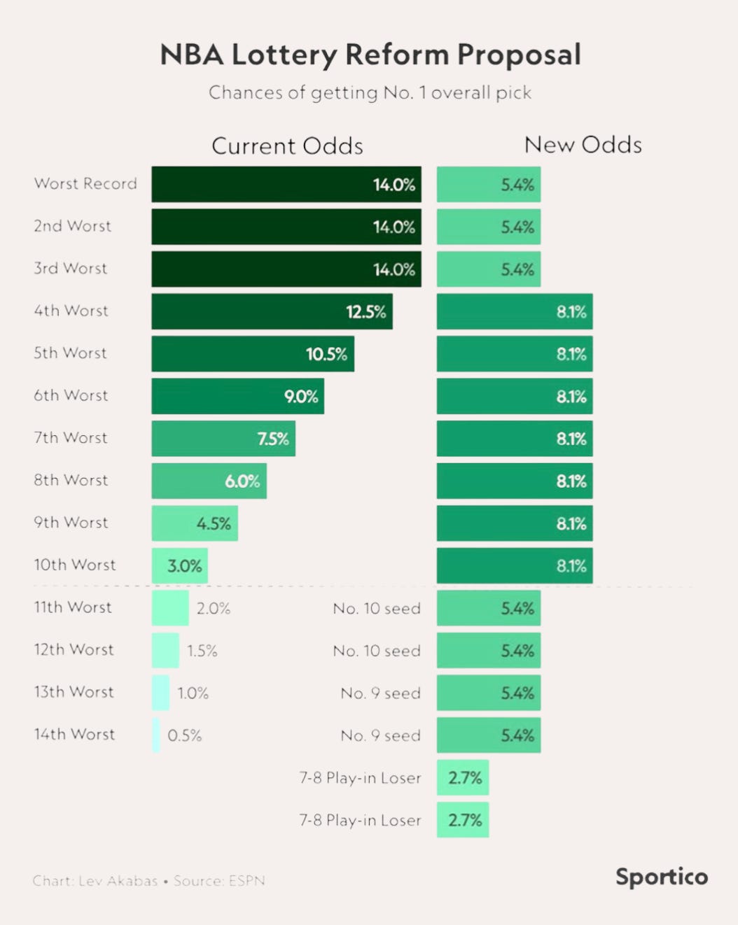
The major non-Playoff news out of the NBA last month was a new draft lottery proposal, one the league is dubbing “3-2-1”. As The Athletic wrote, the proposal “aims to create an environment that heavily incentivizes teams at the bottom end of the standings to win their way up the ranks as a way of improving their lottery odds.” However, the math could be a bit hard to follow in the written word, so I appreciated this chart from Lev Akabas that clearly shows which parts of the standings stand to benefit.
The reception to the proposal has been generally positive, and I agree it’s a step in the right direction. It would clearly incentive teams to avoid being one of the three worst in the league,1 and the hope is that teams will be too embarrassed to tank out of the Play-In game2 on national TV to increase their odds of getting the #1 pick by 2.1%.
The league has stated this would be an experiment of sorts, a placeholder for future reform, and I’d personally like to see a more radical change.
Jamie Ding
I’ve been back home with my parents the last few weeks, so I got to resume the tradition of watching Jeopardy with my Dad3 and I caught the last few games of Jamie Ding’s incredible 31-game run. It was impressive to witness his arcane knowledge across a huge swath of topics,4 as well as his grace when he was finally defeated. He put himself up there with the all-time Jeopardy greats.
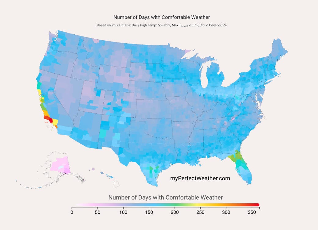
Perfect Weather
After this stint at my parents’ house, Ellen and I will be moving down to San Diego. We’ll be looking for new jobs (if you know anyone hiring in basketball / strategy / analytics or marketing send me a message!), but based on this map we’re excited to have a little time funemployed.
Your Name in Landsat
That weather map makes me, personally, most excited, but this one is broadly cooler. NASA released a tool to the public that holds a collection of their satellite images of natural formations that resemble letters. It allows you to type in any word and see it in nature. Time for a new logo?

The First Ever Sub-2 Hour Marathon
Back on Earth, a human did a thing once thought impossible, when Sebastian Sawe ran 26.2 miles - a marathon - in under two hours. He smashed the previous world record in London, covering the distance in 1:59:30; SportsBall was ready with a chart. Here he shows how much the best marathon time has fallen over the last century.
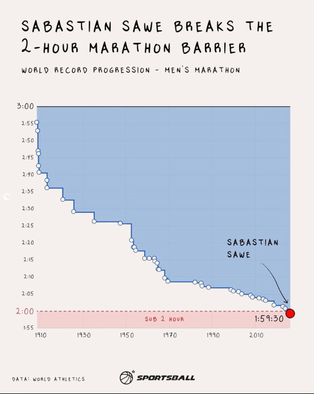
I’ll be curious to see if this turns out to be another four-minute mile event. Famously, many thought that running sub-four was impossible, until it wasn’t. Roger Bannister did it in 1954, unlocking a collective mental block, and soon dozens of other runners also ran a mile in three-something. According to Wikipedia, over 2,000 runners now hold a PB under four minutes.
A second runner has already broken the two-hour marathon mark, as Yomif Kejelcha finished 11 seconds after Sawe in London.
By the way, my favorite perspective on the two-hour marathon is this: The treadmill at your local gym probably tops out at 13 miles per hour, because any faster would be dangerous for most people. Sawe just ran 13.1 miles per hour. For two hours straight!
Based on a True True Story?
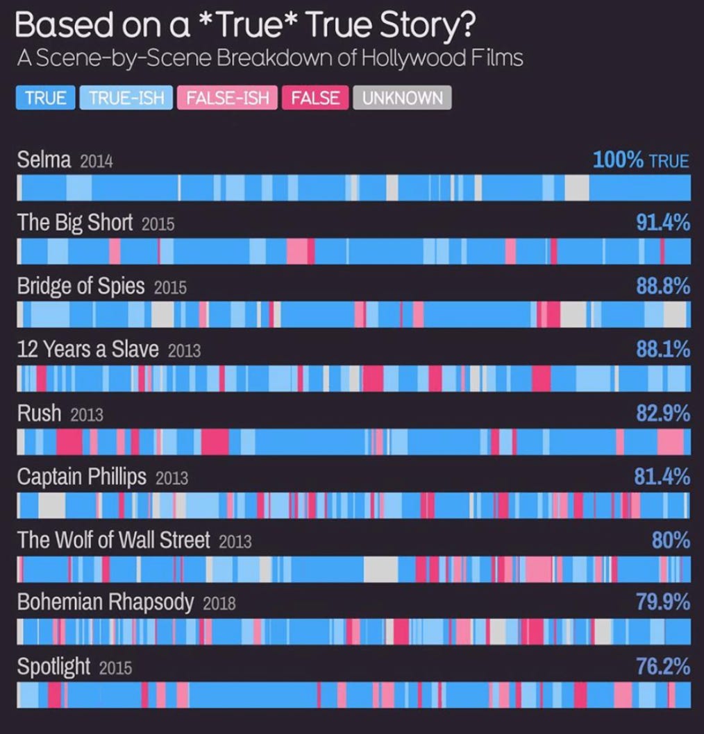
Finally, I really liked these bar charts from Information is Beautiful showing which scenes in popular “based on a true story” movies are actually true. For one, it’s just interesting to know that The Big Short is more accurate than The Wolf of Wall Street.
But, I’m also so impressed that somebody decided to take the time to rewatch all of these movies and note down how much each scene was exaggerated. I’ve done my fair share of manual data collection, and I’m always appreciative when someone else does the grunt work for us. They even published the data so we can confirm that Selena Gomez’s explanation of CDOs and the hot hand fallacy helped make The Big Short more accurate.
If you’re craving more cool charts here are the Jan, Feb, and Mar editions.
Though three teams will still end up in the bottom three by definition. Do we want to punish those teams just for being bad?
Even if the reward for winning is getting unceremoniously swept by the Oklahoma City Thunder.
We record it and watch after the NBA games.
Except sports. Why are Jeopardy contestants always so bad at sports!!
Love the weather map. I grew up in San Diego and am actually there right now for a quick vacation 😂 Congrats on the move! I'm sure you guys will love it.